Hello,
Since my last post, it seems Blogger has been having issues. For example, I can only see one post from my Reading List per day, and when I click "View More" nothing happens. Not sure if I'm the only one with this problem, but nonetheless, it's one of the reasons I haven't posted much lately. Been hoping that the glitches would be quickly fixed, but alas, they have not.
Also, I've been working away on some new, secret projects, so that's also why I haven't shared much.
Anyway, a short while ago, I've updated the tools at my disposal and have been experimenting with sketching and inking digitally. And it's been really fun! To no surprise - there are many benefits to drawing digitally. Here are my favourite:
1. You can erase, redraw, skew, and do all kinds of modifications to your sketch, pretty much infinitely. (Provided you don't delete your original image layer and all you have is some skewed experiment which you don't like the end result of.)
2. No more scanner dust cleanup. For people like me, who are pretty OCD about dust specks making into a nice sketch or inked drawing which I want to show later, this is fantastic. More time drawing, less time hunting for little dots.
3. You can only use one physical drawing tool - the pen stylus - to produce marks similar to pencils, markers, ink pens, paintbrushes, etc. It can take some research and experimenting before you get good at it, especially if you don't often work digitally, but any skill takes time to learn.
There's only one the only thing I dislike about drawing digitally so far:
1. Zooming in and out. Now, this isn't a true dislike. It's more of a personal "quirk" that digital tools let me exploit. I like to fiddle with my drawings, too much at times. So, whereas on paper - the size of my sketch is as big as I let it be on the sheet. And the tiny hand movements are restricted by the dexterity and size of my hand in proportion to the size of my drawing. BUT, if I'm sketching in Photoshop on a tablet - I can zoom in, and in, AND IN, to make tiny little adjustments here and there. This isn't healthy at the sketch stage of an illustration, and something I have to restrain myself from. It's always better to make a new sketch.
Anyhow, that's that. Here are some sketches, both traditional and digital I've done for fun, during work breaks.


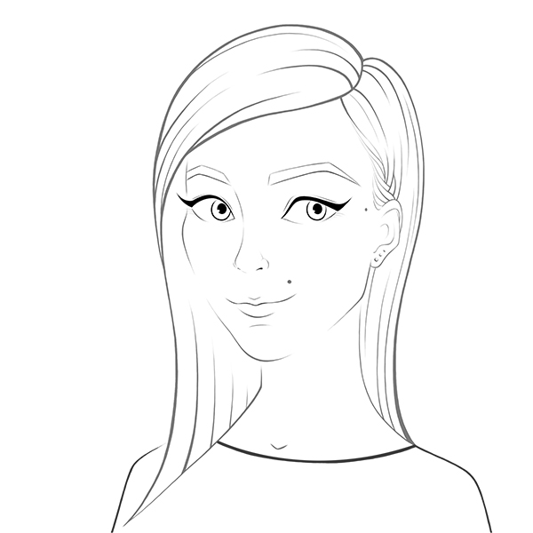
Also, as an exercise to get more comfortable with colouring digitally (so that I can quickly and easily do color studies and coloured concept thumbnails in the near future, and make finished digital illustrations in the slightly less near future) I decided to create a simple self-portrait, in a more comic/cartoon style.
Here is the breakdown of my process. (Pretty much the same as my traditional methods, but way more layers that I could click on and off)
Have a nice week!
Since my last post, it seems Blogger has been having issues. For example, I can only see one post from my Reading List per day, and when I click "View More" nothing happens. Not sure if I'm the only one with this problem, but nonetheless, it's one of the reasons I haven't posted much lately. Been hoping that the glitches would be quickly fixed, but alas, they have not.
Also, I've been working away on some new, secret projects, so that's also why I haven't shared much.
Anyway, a short while ago, I've updated the tools at my disposal and have been experimenting with sketching and inking digitally. And it's been really fun! To no surprise - there are many benefits to drawing digitally. Here are my favourite:
1. You can erase, redraw, skew, and do all kinds of modifications to your sketch, pretty much infinitely. (Provided you don't delete your original image layer and all you have is some skewed experiment which you don't like the end result of.)
2. No more scanner dust cleanup. For people like me, who are pretty OCD about dust specks making into a nice sketch or inked drawing which I want to show later, this is fantastic. More time drawing, less time hunting for little dots.
3. You can only use one physical drawing tool - the pen stylus - to produce marks similar to pencils, markers, ink pens, paintbrushes, etc. It can take some research and experimenting before you get good at it, especially if you don't often work digitally, but any skill takes time to learn.
There's only one the only thing I dislike about drawing digitally so far:
1. Zooming in and out. Now, this isn't a true dislike. It's more of a personal "quirk" that digital tools let me exploit. I like to fiddle with my drawings, too much at times. So, whereas on paper - the size of my sketch is as big as I let it be on the sheet. And the tiny hand movements are restricted by the dexterity and size of my hand in proportion to the size of my drawing. BUT, if I'm sketching in Photoshop on a tablet - I can zoom in, and in, AND IN, to make tiny little adjustments here and there. This isn't healthy at the sketch stage of an illustration, and something I have to restrain myself from. It's always better to make a new sketch.
Anyhow, that's that. Here are some sketches, both traditional and digital I've done for fun, during work breaks.
Also, as an exercise to get more comfortable with colouring digitally (so that I can quickly and easily do color studies and coloured concept thumbnails in the near future, and make finished digital illustrations in the slightly less near future) I decided to create a simple self-portrait, in a more comic/cartoon style.
Here is the breakdown of my process. (Pretty much the same as my traditional methods, but way more layers that I could click on and off)
 |
| Loose sketch |
 |
| Digital line-work/ink |
 |
| Added some simple colouring underneath the inking and that's what it looked like with the linework turned off. |
 |
| Made some color adjustments to the some of the line-work to make it more in tone with the colous underneath. |
 |
| Finished off the piece by adding some subtle patterns. |
 |
| And made a GIF of these main steps, because it only takes me a minute to do that. |
Have a nice week!