Showing posts with label nature. Show all posts

Tuesday, April 4, 2017

Fundraiser Results

Good evening,

So, this is a quick follow up entry to my previous post on the fundraising initiative.

The results are in and I'd like to say a big thank you to everyone who's bought my art in the month of March and helped me raise money towards a wildlife conservation donation. The grand total was $60.00!

After some research, I've decided to donate the proceeds to the Nature Conservancy of Canada.

Thank you again and have a happy April!

Buntzen Lake, BC.

Saturday, March 4, 2017

Help Me Help The Planet

Good afternoon friends and happy March! 

My birthday is coming up this month and to thank the universe for keeping me alive for these last 26 years I was hoping to so some fund raising for environmentalist groups and animal conservation charities. I am still researching which ones would be the best fit, but was planning on keeping it local to British Columbia/Canada. 


As you might have noted from my previous self promotions, I have a number of places online where I sell originals, prints and merchandise of my work. So, my idea is that for the month of March, all proceeds from the pieces I sell, I'll donate. I hope you'd like to help me help our planet, and order yourself a little something. Every little bit is appreciated. :)


Northern Spotted Owls

Please find below links to my shops:

Etsy (original art and signed prints)
Society6  
RedBubble
INPRNT


Have a great weekend!


Monday, June 15, 2015

The Fox's Tower and Other Tales (Cover Art)

Hello friends!

I have some exciting news!
A few months ago, the lovely Yoon Ha Lee hired me to do the cover artwork for her eBook fairytale collection "The Fox’s Tower and Other Tales"  which has been released today!


It can be found at the following places:
Amazon.com
Barnes & Noble
Google Play
Kobo
Smashwords

A peek at the contents can be found at the Barnes & Noble page.
The cover before text was added.
Close up of the tower
Close up of the fox
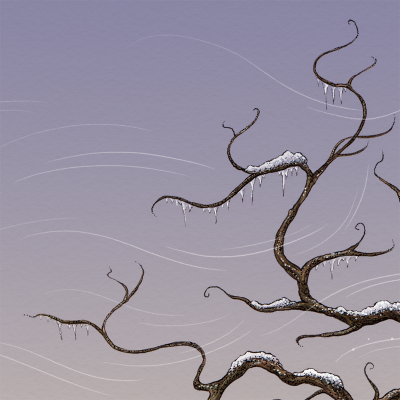
And a close up of some branches
This illustration is a media hybrid. It was mostly painted with waterproof coloured inks, watercolour, and gouache. However, the sky, wind, and a few other things were completed digitally.

Here's a fun gif of the process!


Cheers!

Monday, March 30, 2015

Justice - Industry Versus the Environment

Hello, hello!

Today I'm posting about a recent illustration I've made for a gallery show.

It was created for the Ostara Tarot: A Celebration of Tarot show which is on at The Fall Tattooing and Artist's Gallery from March 20th to April 18th. This show celebrates the launch of the new Ostara Tarot deck (which I designed for and blogged about earlier), and also includes original artworks by 22 participating artists. 

Each of the participating artists was asked to pick a Major Arcana card and to embody the essence of the card in their art piece. 

I chose Justice and drew my inspiration from my personal concern for the environment, which has as of late, particularly locally, been threatened by pipeline projects, mining spills, chemical fires, and other man made injustices.

Amidst all such avoidable disasters - where is the respect for the earth that provides us with air, water, and diverse nature to explore and enjoy? These are all finite things unless they are protected.

In the case of Justice: Industry Versus the Environment - what is the verdict? Which way do the scales tip? Which way should they tip?

I hope that all those who read this give this some thought and what part they play in the matter.


Below, is my usual illustration process break down, for those interested.

1. Compositional sketch - somewhat roughly penciling in where I wished the all the elements to go.

Sketch
2. Inking - After doing a basic outline with ink and doing some shading work with crosshatching techniques and such, I realized that I've made some silly mistakes and would need to start over. You see, I definitely went overboard with certain details, which the excess of would prove to be distracting. I'm talking about the decoration of the scales. Truly unnecessary. Also, the birds flying up from the mountainous island risked being mistaken for insects, or something else which I did not intend.
First inking attempt. When in doubt - restart.

3. Inking (Take 2) - I returned to my sketchbook and experimented with a few ideas, finally deciding to substitute the birds for some clouds.
Second inking - that's better, provided nothing else goes horribly wrong.
4. Shading - I used a number of methods to reach a desired look, including cross-hatching, stippling, and white gouache intervention.
Shading in-progress. Look- some birds have been added!

5. The Midas Touch - After finishing with the black and white shading with my pen and ink, I decided to add a touch of gold to the piece. It would both be a nice way of making the chains on the scales pop against the grey-scale scene and of making a symbolic suggestion. 
Finished piece


Some close ups. (Click to view larger)


Before framing the piece, I took a few quick shots with my phone to show the glistening of the gold.


6. Framing - and now, the illustration looks somewhat like this, but with a mat.


I hope to come back soon to the gallery and take some nice photos of my piece on the wall, as well as the works of my colleagues.

Image size: approximately 4.5 x 6.5 inches
Media: micron pens + gouache + gold coloured acrylic paint on paper for mixed media.

Thanks for reading and looking!
Prints are now available at my Society6 shop. Proceeds will be donated to environmentalist groups, like the Dogwood Initiative and the David Suzuki Foundation.

Tuesday, February 11, 2014

Fancy a Fox?

Hello,

So, today I'm just going to be sharing a quick fox portrait I did over the weekend. Though rendering characters and scenes photo-realistically isn't usually part of my illustration style, I do think it's important to practice painting and drawing in a naturalistic fashion. I find that it helps me to better memorize the physical traits of different animals, plants, etc, which later translate much easier to more stylized works and spontaneous sketches.

I usually just like to work with ink washes for my animal portrait, but this time I played around with layering graphite pencil with ink washes back and forth to get the tones and textures I wanted.

Inari the Fox

I've named her Inari, after the Japanese fox spirit. She's a red fox.

Now, here are some process images:
Some ink washes and graphite texturing on the face.
Pretty much the finished version with a white background.
(Eye highlights are done with white gouache)
Played around in Photoshop to see how a sepia might look

Added the background with some more washes of ink and graphite shading and smudging. Also used white gouache to add some highlights to the fur. And some more playing around with sepia toning in Photoshop, of course.
My preferred version
 Prints available here on Society6

Original size: 4.5 x 6"
Paper: Strathmore 400 Series Mixed Media
Tools: Pelikan Black ink (17), Staedler graphite pencils, and Desinger Gouache - Permanent White (008)

Wishing everyone a great week, as always! =)

All images are  ©Mariya Olshevska

Tuesday, October 1, 2013

Losing Altitude - Northern Spotted Owls

 
Hi there,
Today I'm going to do a quick process post about my latest painting - "Northern Spotted Owls (Strix occidentalis caurina)" It was a piece I did for Losing Altitude - an upcoming book about threatened/endangered birds. This collaborative art book will feature over 50 artists and well over 100 pages of beautiful, full-color art of endangered birds from the world over.

Check it out here: https://www.facebook.com/LosingAltitude

And now for the process.
1. As usual, I sketched out some thumbnails. to see what layout I wanted to work with.
As you can see from the finished product, the image ended being a combination of all 4 of these.
2. After getting my references together I went on to penciling. I like use the double penciling approach - where I first get the shapes and elements down more loosely with my blue pencil and then go over ad add more details with a graphite pencil.
Close up of the adult owl.
3. Then came my favourite part- the inking, using my black microns.
Adding even more detail during this stage.
After inking the whole image, I erase the pencil marks.


4. For this piece I decided to do a grey-scale values under-layer. It seemed like a logical idea since the owlets were mostly grey.
Almost fully rendered under-layer. I ended up darkening the adult owl some more later.

5. Then I got my coloured, waterproof inks out and finished up the painting, sprinkling some table salt on the background for hazy effect. Oh, and of course - for the final touch I used white gouache to add some shine and detail to the birds' feathers.

Here are some close ups:


-Original size: 11 x 17.7"
-Materials: Waterproof coloured inks, microns, white gouache, and salt on 300 series Strathmore Vellum Bristol paper

Prints available at my Society6 shop =)

Cheers for now!

Friday, May 3, 2013

Freebie Friday - Green Dream Textile Textures

Yes, more textile resource week:)

Today I'm contrasting last week's theme by putting up some green patterned textile textures. Enjoy!


Again, feel free to use these resources for personal or professional projects but please:

Do not claim the original resource images as your own,
Do not redistribute commercially. Basically, don't save and sell the resources as your own, but by all means do share the link to this page with others. :)
Do not use these textures as a base to create your own stock art/resources.

And, please share anything you've made with these resources with me. I'd love to have a look! =)

*In quick other news - I'm almost done a new little illustration. Lots of process documentation for that one. Stay tuned=)

Happy Friday!

Saturday, March 23, 2013

Playing Outside With Imagination and Pride

Happy Saturday!

So, today I'm sharing with you a revisit of some ideas and themes I worked with last spring. My inspiration comes from my childhood memories of enjoying imaginative play-times outside. Currently I'm using those ideas and themes and reworking them into a collection of illustration + poetry spreads which will hopefully turn into a nice book sometime =)

"Little Lilac Ladies"

Ancient myths say mystic powers
Are given to some lilac flowers.
Those having five petals or more
Store magic wishes at their core.

This piece alludes to how my friends and I would comb through lilac bushes in search of 5 petaled flowers because supposedly they had wish granting powers!
 And some process steps:

Inked floral work

Painted floral work
Again, the finished piece


"Helping Hands"

When spring returns back to the land,
Little birds could use a hand
With making cozy, tidy nests
For themselves and for their guests.

This illustration reflects how in the spring my friends and I would build nests out of grass to help the birds out :)
(rhymes + illustrations are all by me)

Size: 11x17"
Media: Waterproof inks + watercolour + gouache + microns

Wednesday, August 8, 2012

Spring Owl (Speedpaint)

Well, this was my idea of speed painting - traditionally with watercolors.
This piece took a little over an hour, I think. I'm not quite sure because halfway through the power went out and it was completely dark for some time, and then I had to step away for a moment. But yeah, around an hour, not much more.
I found a reference image in an old calendar and just went for it, and had fun.

I painted the majority of the picture with watercolors and then added some detail with Prismacolor brown 005 point pen, and squeezed in a few touches with gouache.

Size: 6 x 8.75 inches
Paper: Canson acid free mat board, off-white
Paint: St. Petersburg watercolor box set

I think I'll do more of these type of "speed paintings". It seems like a great way to use up some scrap mat board and paper :)