Showing posts with label ink. Show all posts

Tuesday, September 26, 2017

Memorial Portrait

Hello there,

It's been some time since my last post, and I hope that everyone's summer has been a nice one.

I've been very fortunate in that the circumstances in my life had finally worked out in such a way that I was finally able to visit Iceland, which was a dream of mine for about 10 years now. It was definitely a much needed getaway and a very uplifting trip. Though I did not do any plein air sketching or painting, I took a large number of photos and perhaps in the near future I'll use these for a fantasy illustration.

In more sad news, a month ago, my beloved childhood cat Toma (nicknamed Tomcat) has passed away at the age of 18. Although she passed peacefully, it was (and is) still very hard to come to terms with. Rationalizing that she had a healthy and comfortable life did little to ease ease feelings of loss, regret, and pain. So, I just tried to do something nice to honor her memory. I was very nervous about how it would turn out, but in small steps I worked towards painting her portrait. In the end, I'm pretty happy with the results.
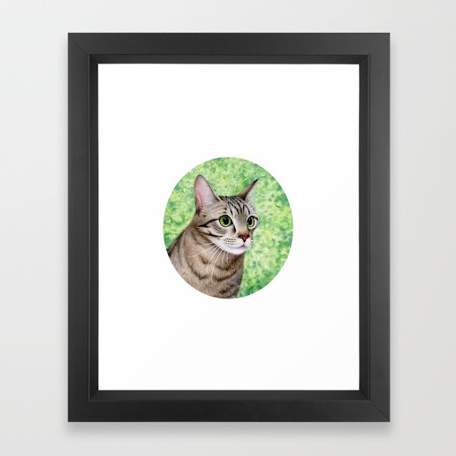

Looking through all the photos we had of her, I picked a reference which I thought would work best for the composition I had in mind and would come closest for the expression and mood I was hoping to capture.
As usual, I started with a pencil sketch. Then did some ink with my micron pens to map out the main features and stripes in the fur.


Next, I tackled the background. I wanted it to have an impressionistic feel; suggestive of some of whimsical, forested area, but keeping the focus on Tomcat's face. I wanted to believe her spirit lives on somewhere green, lush and happy.


Then, I worked at building up subtle layers of colour to illustrate the softness of her fur, finishing off with touches of white gouache for the whiskers, eyebrows, and eye glimmers.

close up
For the final touches, I added a little bit of gold paint to add some accents to the eyes, fur, and the background. It's by no means an addition that has a visible impact on the finished piece after digital reproduction, but I find it to be a pleasant, understated feature of in person viewing.


 (I apologies for the lesser quality images of my in-process work. Unfortunately, I did not have the scanner conveniently within my reach, so all the work in progress photos are made on my phone.)

1999-2017
Anyways, if you enjoy the piece, there are now art prints and post cards available for sale. Profits from the sales with will be donated to two local cat charities which I like to support - VOKRA and Katie's Place.

Please find prints available on:

-Society6
-RedBubble
-InPrint
-TeePublic
-DesignByHumans 

Media: Pigma Micron + Prismacolor fine line archival marker pens, Koh-I-Noor (waterproof) drawing inks, watercolour, Acryla gouache on Strathnore "Mixed Media" vellum surface paper.
Paper Size: 8.5 x 11 inches
Painting Size: 5.5 x 6 inches

Thanks for visiting! In farewell, I leave you with one of my favourite pictures of her.

"Outside seemed better from far away."

Thursday, August 20, 2015

Mr. Holmes at the Canadian National Expo

Hello friends!

Today, I'm happy to share with you some neat news!
My illustration - "Mr. Holmes" will be taking part of the The Game is Afoot: Consulting Sherlock Holmes exhibit at the Canadian National Expo in Toronto Canada. The CNE will be on from August 21st to September 7th, so if you're in the area - come check it out!

Additionally, I was very humbled that my piece was chosen to be the image headlining the exhibit on the CNE website.

Below are some screenshots from their page, and a blurb about the exhibit:

"Sherlock Holmes is more popular than ever! He continues to be reinvented since he was first introduced by Sir Arthur Conan Doyle in 1887. This exhibit takes a look at the evolution of Sherlock Holmes over the years and provides an opportunity for you to test your detective skills with some fun and interactive games!"

CNE Exhibits Page

The Game is Aftoot: Consulting Sherlock Homes
CNE PDF Guidebook (page 14)


And here's a quick process gif of the illustration, because - why not!


Tuesday, November 4, 2014

Inktober Challenge: Completed!

Hello, and welcome to November. Congratulations on surviving the "boos" and pumpkins of October and good luck on making it though the Christmas decorations already overtaking the towns. They start appearing earlier each year, don't they?

Anyhow, a few posts ago I mentioned joining in the Inktober challenge fun. Originally, I was only aiming to complete 2 drawings a week, but then I ended up making all 31. They're all pretty small - on average less than 3x3 inches in size, and "casual" compared to the style of my finished work but I'm still pretty proud of myself for setting aside time for them. My theme was tokens and characters from my favourite films. Hope you enjoy!

Calendar view =) Films were picked each day based on mood.
 And here are a few close ups:

part 1

part 2

part 3
Oh, and if you're curious about which movies have been represented here's the list below.  (You can also flip through the images individually and read a tad more about the pictures via my Instagram page)

1. Harry Potter and the Chamber of Secrets. (I'm a fan of the 1st and 2nd movies, less pleased with the ones that followed)
2. Lord of the Rings - The Two Towers (I love all three parts of the trilogy, this was just the one the quotation is from)
3. The Mummy (Love The Mummy Returns also)
4. The Fifth Element
5. The Third & The Seventh (Only 12 minutes long, but fantastic)
6. You've Got Mail
7. The Fountain
8. Frozen
9. Pirates of the Caribbean (Fairly fond of all of them)
10. Inception
11. How to Train Your Dragon
12. How to Train Your Dragon 2
13. Tangled
14. The Wedding Singer
15. Ice Age
16. Disney's Robin Hood
17. Ghostbusters (1 and 2)
18. Titanic
19. Meet Joe Black
20. Sherlock Holmes
21. Guardians of the Galaxy
22. Wedding Crashers
23. Tristan and Isolde
24. James Bond - Skyfall
25. Hellboy
26. X-Men: First Class (I'm a fan of all the X-Men films, but I'll say that First Class and Days of Future Past are my favourite)
27. Batman Begins (Love all 3 films from the Dark Knight trilogy)
28. Back to the Future (The 1st and 3rd of the trio are great, but I'm not very fond of the 2nd one for some reason)
29. The Avengers
30. Lord of the Rings - The Fellowship of the Ring
31. Lord of the Rings - The Return of the King (There were still a few movies I could have given a nod to, but I decided to finish off the challenge by rounding out my Lord of the Rings collection because if I had to pick my MOST favourite film (or trilogy) that would be it.)

*Most of the pieces were completed with micron pens, ink wash, and/or white ink/gouache. 

Thanks for visiting! =)

All images are ©Mariya Olshevska

Wednesday, October 8, 2014

Inktober Challenge

Happy Wednesday!

So, it's that time of year again - Inktober. If you've never heard of it: "every October, artists all over the world take on the Inktober drawing challenge by doing one ink drawing a day the entire month."

I decided to give it a try because I love inking! It's always one of my favourite parts of completing an illustration. My personal objective is to encourage myself to sketch more random things for fun outside work, without getting OCD about details. And I've given myself a theme: tokens and characters from my favourite films. So far, I've been keeping up, sharing my little ink drawings on my Instagram and Twitter pages each day. I've been drawing pretty small on some scrap watercolour paper and here's what I have so far:


Fawkes from "Harry Potter and the Chamber of Secrets" | 3.5 x 2.65" | micron pens

The Leaf of Lorien brooch from "The Lord of the Rings" trilogy | 2.75 x 2.75" | bamboo pen +microns
The Key to Hamunaptra from "The Mummy" | 2.75 x 2.375" | micron pens
The element stones from "The Fifth Element" | 2.125 x 2.5" | micron pens
A scene from "The Third and the Seventh" | 3 x 4.5" | ink wash
The subway butterfly from "You've Got Mail" | 2 x 2.45
The Mayan dagger/map from "The Fountain" | 2.5 x 3" | microns, marker + gouache
Elsa's sovereign's orb from "Frozen" | 2 x 2" | pencil + microns
Are you also doing the Inktober challenge? Share a link to where you post your drawings!

Have a great week!


Friday, May 2, 2014

Freebie Friday - Stained Coffee Textures

Happy Friday!

Today I have an extra large texture pack to share with you - 11 pieces of coffee colored paper stained with various things found at home. Sort of the opposite idea than the "Coffee Stains Textures". Here, there are stains created with salt, alcohol, lemon juice, candle wax, and some letter stamps with an "M" or a "W" hand stamp I've found bargain hunting. These textures were really fun to make and now my studio smells like coffee and ink! Enjoy and use wisely!


Feel free to use these resources for personal or professional projects but please:

Do not claim the original resource images as your own,
Do not redistribute commercially. Basically, don't save and sell the resources as your own, but by all means do share the link to this page with others. :)
Do not use these textures as a base to create your own stock art/resources.

And, as always, please feel free to share anything you've made with these resources with me. I'd love to have a look! =)

Previous Freebie Friday posts:

Freebie Friday - Layered Lace Textile Textures
Colourful + Abstract Textile Textures
Branches, Berries and Blossoms
Blue Pattern Textile Textures
Black and White Textiles (part 3)
Black and White Textiles (part 2)
Black and White Textiles (part 1)
Coffee Stained Paper
Fanciful Florals
Vintage Inspired
Green
Red
Denim

Enjoy May everyone!

Tuesday, February 11, 2014

Fancy a Fox?

Hello,

So, today I'm just going to be sharing a quick fox portrait I did over the weekend. Though rendering characters and scenes photo-realistically isn't usually part of my illustration style, I do think it's important to practice painting and drawing in a naturalistic fashion. I find that it helps me to better memorize the physical traits of different animals, plants, etc, which later translate much easier to more stylized works and spontaneous sketches.

I usually just like to work with ink washes for my animal portrait, but this time I played around with layering graphite pencil with ink washes back and forth to get the tones and textures I wanted.

Inari the Fox

I've named her Inari, after the Japanese fox spirit. She's a red fox.

Now, here are some process images:
Some ink washes and graphite texturing on the face.
Pretty much the finished version with a white background.
(Eye highlights are done with white gouache)
Played around in Photoshop to see how a sepia might look

Added the background with some more washes of ink and graphite shading and smudging. Also used white gouache to add some highlights to the fur. And some more playing around with sepia toning in Photoshop, of course.
My preferred version
 Prints available here on Society6

Original size: 4.5 x 6"
Paper: Strathmore 400 Series Mixed Media
Tools: Pelikan Black ink (17), Staedler graphite pencils, and Desinger Gouache - Permanent White (008)

Wishing everyone a great week, as always! =)

All images are  ©Mariya Olshevska

Sunday, November 11, 2012

Meticulous Maiden - Fair Flora

Hi!
It's been a while since I've posted some art along with my steps.
After acquiring a hand injury this piece was particularly challenging, especially since it's likely my most detailed illustration thus far.


I present to you my vision of the goddess Flora. This piece was inspired by various interpretations of flora I've seen throughout my life, and from quite recently a description of the Welsh goddess Olwen. In my version though, she is adorned with red clovers (for stylistic purposes) and she her hair is made from spring flowers. (Flowers include: clovers, dandelions, crocuses, camellias, magnolias, periwinkles, catkins, bell flowers, baby's breath, hyacinths, hydrangeas, lisianthuses, daisies, snow drops, lilies of the valley, morning glories, and perhaps some more flowers which I've forgotten.)

Oh, and this piece was for as set of promotional postcards.

Here's how it all came together:

The humble, little thumbnail

Rough sketch

Loose pencil. Really, if I penciled in all the flowers at once I would have gone bonkers.
Colour study. Ended up taking a different approach in the end

Inked line-work, stage 1. (I worked in chunks penciling and inking, one right after the other)
Inked line-work, stage 2. I decided to try out a method less familiar to me - 'silhouette inking' certain vines and leaves
Here, I coloured most flowers. (Still needed to paint her face and add more depth to certain sections)
(click to enlarge) Finished piece! Front and back of my postcard

close ups


Materials:
`Bristol Smooth Paper
`Micron pens
`Koh-i-Noor waterproof colour inks
`Gouache
`Watercolour

Approximate Size:
7.5 x 10.5 inches