Showing posts with label drawing. Show all posts

Thursday, August 20, 2015

Mr. Holmes at the Canadian National Expo

Hello friends!

Today, I'm happy to share with you some neat news!
My illustration - "Mr. Holmes" will be taking part of the The Game is Afoot: Consulting Sherlock Holmes exhibit at the Canadian National Expo in Toronto Canada. The CNE will be on from August 21st to September 7th, so if you're in the area - come check it out!

Additionally, I was very humbled that my piece was chosen to be the image headlining the exhibit on the CNE website.

Below are some screenshots from their page, and a blurb about the exhibit:

"Sherlock Holmes is more popular than ever! He continues to be reinvented since he was first introduced by Sir Arthur Conan Doyle in 1887. This exhibit takes a look at the evolution of Sherlock Holmes over the years and provides an opportunity for you to test your detective skills with some fun and interactive games!"

CNE Exhibits Page

The Game is Aftoot: Consulting Sherlock Homes
CNE PDF Guidebook (page 14)


And here's a quick process gif of the illustration, because - why not!


Tuesday, July 7, 2015

Meet the Artist Tag


“Meet The Artist” tag from @Sketch_Dailies topic on Twitter. A little something to show that I'm still alive and working.

I used Kyle T. Webster’s digital brushes for all the Photoshop drawing and some experimentation with the Gradient tool to do the rest.

Portrait without text
Process gif!
If you'd like to see more frequent art updates, please "like" my Facebook page, and if you'd like to see miscellaneous snippets of my daily life, then please follow me on Instagram.

Have a great Tuesday guys!

Monday, March 30, 2015

Justice - Industry Versus the Environment

Hello, hello!

Today I'm posting about a recent illustration I've made for a gallery show.

It was created for the Ostara Tarot: A Celebration of Tarot show which is on at The Fall Tattooing and Artist's Gallery from March 20th to April 18th. This show celebrates the launch of the new Ostara Tarot deck (which I designed for and blogged about earlier), and also includes original artworks by 22 participating artists. 

Each of the participating artists was asked to pick a Major Arcana card and to embody the essence of the card in their art piece. 

I chose Justice and drew my inspiration from my personal concern for the environment, which has as of late, particularly locally, been threatened by pipeline projects, mining spills, chemical fires, and other man made injustices.

Amidst all such avoidable disasters - where is the respect for the earth that provides us with air, water, and diverse nature to explore and enjoy? These are all finite things unless they are protected.

In the case of Justice: Industry Versus the Environment - what is the verdict? Which way do the scales tip? Which way should they tip?

I hope that all those who read this give this some thought and what part they play in the matter.


Below, is my usual illustration process break down, for those interested.

1. Compositional sketch - somewhat roughly penciling in where I wished the all the elements to go.

Sketch
2. Inking - After doing a basic outline with ink and doing some shading work with crosshatching techniques and such, I realized that I've made some silly mistakes and would need to start over. You see, I definitely went overboard with certain details, which the excess of would prove to be distracting. I'm talking about the decoration of the scales. Truly unnecessary. Also, the birds flying up from the mountainous island risked being mistaken for insects, or something else which I did not intend.
First inking attempt. When in doubt - restart.

3. Inking (Take 2) - I returned to my sketchbook and experimented with a few ideas, finally deciding to substitute the birds for some clouds.
Second inking - that's better, provided nothing else goes horribly wrong.
4. Shading - I used a number of methods to reach a desired look, including cross-hatching, stippling, and white gouache intervention.
Shading in-progress. Look- some birds have been added!

5. The Midas Touch - After finishing with the black and white shading with my pen and ink, I decided to add a touch of gold to the piece. It would both be a nice way of making the chains on the scales pop against the grey-scale scene and of making a symbolic suggestion. 
Finished piece


Some close ups. (Click to view larger)


Before framing the piece, I took a few quick shots with my phone to show the glistening of the gold.


6. Framing - and now, the illustration looks somewhat like this, but with a mat.


I hope to come back soon to the gallery and take some nice photos of my piece on the wall, as well as the works of my colleagues.

Image size: approximately 4.5 x 6.5 inches
Media: micron pens + gouache + gold coloured acrylic paint on paper for mixed media.

Thanks for reading and looking!
Prints are now available at my Society6 shop. Proceeds will be donated to environmentalist groups, like the Dogwood Initiative and the David Suzuki Foundation.

Wednesday, January 28, 2015

Ice-Cream + Beer = Collective Arts Brewing - Series 4

Hi friends! I got some exciting news this week - that this little, quirky illustration below will soon appear on beer labels from Collective Arts Brewing, as part of their Series Four craft beer. Thanks so much Collective Arts! :)


Series Four is scheduled to be available to the public by mid-March 2015.
There will also be a Reveal Party at THE GARRISON, 1197 Dundas Street West in Toronto, on February 19, 7:30PM. I probably won't be able to make it, but if you're in the area, you should check it out! More details & RSVP here.

Check out all the other artists of Series Four via {this link}!
"I don't always eat ice-cream, but when I do - I choose my cone carefully."
Additional info:
- This illustration, along with a few of my other pieces, was part of one The Postcard Shows.
- Rendered with micron pen, waterproof inks, and white pencil.
- Prints + etc available on Society6 + RedBubble + DesignByHumans

Update - March 25th, 2014:

Recently, I received my sample bottle in the mail and I took a few photos to share. It looked wonderful in person!


The mini print of "Ice-Cream Cones" in the photos is a postcard print ordered from Moo.com.

Cheers!

Tuesday, June 24, 2014

Pencil Portraits and Digital Doodles

Hello,

Since my last post, it seems Blogger has been having issues. For example, I can only see one post from my Reading List per day, and when I click "View More" nothing happens. Not sure if I'm the only one with this problem, but nonetheless, it's one of the reasons I haven't posted much lately. Been hoping that the glitches would be quickly fixed, but alas, they have not.
Also, I've been working away on some new, secret projects, so that's also why I haven't shared much.

Anyway, a short while ago, I've updated the tools at my disposal and have been experimenting with sketching and inking digitally. And it's been really fun! To no surprise - there are many benefits to drawing digitally. Here are my favourite:

1. You can erase, redraw, skew, and do all kinds of modifications to your sketch, pretty much infinitely. (Provided you don't delete your original image layer and all you have is some skewed experiment which you don't like the end result of.)

2. No more scanner dust cleanup. For people like me, who are pretty OCD about dust specks making into a nice sketch or inked drawing which I want to show later, this is fantastic. More time drawing, less time hunting for little dots.

3. You can only use one physical drawing tool - the pen stylus - to produce marks similar to pencils, markers, ink pens, paintbrushes, etc. It can take some research and experimenting before you get good at it, especially if you don't often work digitally, but any skill takes time to learn.

There's only one the only thing I dislike about drawing digitally so far:

1. Zooming in and out. Now, this isn't a true dislike. It's more of a personal "quirk" that digital tools let me exploit. I like to fiddle with my drawings, too much at times. So, whereas on paper - the size of my sketch is as big as I let it be on the sheet. And the tiny hand movements are restricted by the dexterity and size of my hand in proportion to the size of my drawing. BUT,  if I'm sketching in Photoshop on a tablet - I can zoom in, and in, AND IN, to make tiny little adjustments here and there. This isn't healthy at the sketch stage of an illustration, and something I have to restrain myself from. It's always better to make a new sketch.

Anyhow, that's that. Here are some sketches, both traditional and digital I've done for fun, during work breaks.


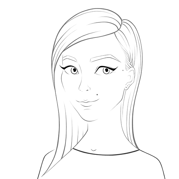
Also, as an exercise to get more comfortable with colouring digitally (so that I can quickly and easily do color studies and coloured concept thumbnails in the near future, and make finished digital illustrations in the slightly less near future) I decided to create a simple self-portrait, in a more comic/cartoon style.
Here is the breakdown of my process. (Pretty much the same as my traditional methods, but way more layers that I could click on and off)

Loose sketch
Digital line-work/ink

Added some simple colouring underneath the inking and that's what it looked like with the linework turned off.
Made some color adjustments to the some of the line-work to make it more in tone with the colous underneath.
Finished off the piece by adding some subtle patterns.
And made a GIF of these main steps, because it only takes me a minute to do that.

Have a nice week!

Tuesday, March 11, 2014

Pattern Pastimes

Happy Tuesday :)

Today I'm just doing a quick post about why hand-patterning is a pleasant and positive pastime for me.

Basically, when I'm looking to take a break from my various art projects and still want to do something productive, I grab some pens or paints and I draw patterns. It's great for me because:

1. It's very relaxing and helps me think about things that are happening in my personal and work lives.

2. It trains my hand to more easily render intricate details and shapes, which are integral to my illustration style.

3. It's also an exercise in balance - balancing amount of details, and element types.

4. I can do this pretty much anywhere, anytime. All I need is a few pencils, pens, some decent paper, and a flat surface to work on.

5. Best of all, it's just fun for me. I've been patterning things here and there ever since I was 5 years old.

Now, here are a few small, postcard-sized (under 5 x 7") pieces I've done last month.

Freehand-Patterned Teapots - No preliminary pencil work for the pattens.
Pencil-Planned Patterned Cake - Here I penciled the pattern grids only. The patterns withing the squares are free-handed.
Pattern Vortex - This piece had a bit more penciling underneath the pen. For some of the triangles and squares I drew a few notches to space out the lines evenly.


Have a great week everyone!
Some prints and things at my Society6 shop, as always :)
{Facebook Art Page}

Tuesday, February 11, 2014

Fancy a Fox?

Hello,

So, today I'm just going to be sharing a quick fox portrait I did over the weekend. Though rendering characters and scenes photo-realistically isn't usually part of my illustration style, I do think it's important to practice painting and drawing in a naturalistic fashion. I find that it helps me to better memorize the physical traits of different animals, plants, etc, which later translate much easier to more stylized works and spontaneous sketches.

I usually just like to work with ink washes for my animal portrait, but this time I played around with layering graphite pencil with ink washes back and forth to get the tones and textures I wanted.

Inari the Fox

I've named her Inari, after the Japanese fox spirit. She's a red fox.

Now, here are some process images:
Some ink washes and graphite texturing on the face.
Pretty much the finished version with a white background.
(Eye highlights are done with white gouache)
Played around in Photoshop to see how a sepia might look

Added the background with some more washes of ink and graphite shading and smudging. Also used white gouache to add some highlights to the fur. And some more playing around with sepia toning in Photoshop, of course.
My preferred version
 Prints available here on Society6

Original size: 4.5 x 6"
Paper: Strathmore 400 Series Mixed Media
Tools: Pelikan Black ink (17), Staedler graphite pencils, and Desinger Gouache - Permanent White (008)

Wishing everyone a great week, as always! =)

All images are  ©Mariya Olshevska

Sunday, June 17, 2012

Cedric the Snooze


"Cedric the Snooze"

Cedric the Snooze
drank too much booze,
so on pillows he drifted,
till his spirits were lifted.

That was another sketchbook doodle I've completed recently, accompanied by an impromptu poem.

Happy Sunday!

Friday, April 13, 2012

"Violet Hour" - Patterned Meticulousness

"Violet Hour" by Mariya Olshevska


So here is the final illustration I did for the Decorative Illustration class, a.k.a my favourite class this semester. For this project we were particularly encouraged to go crazy with details and embellishments...and so I did. This piece didn't turn out to have as much compositional complexity as I originally wanted, but I still like it quite a bit. Originally I wanted Celtic knot-work in the background, which would then have finer patterning inside. So I guess I'll fulfill that musing in my spare time in the summer. I love swirls and patterns!

Anyhow here's the final piece and some of the process below:

thumbnail sketch

rough sketch

line work

Final Piece!
close up
another close up
 Info:
Image size: 15 x 10.3 inches
Bristol type paper
Line-work done with black micron pens ranging from 0.05 to 0.2, and a violet prisma colour pen of 0.05 width
+ a little bit of diluted waterproof ink for the pink blush in the cheeks and lips
Time: unknown, but far longer than 1 hour

P.S. - The title of the piece is inspired by the song "The Violet Hour" by The Civil Wars, a song which I love and imagine this illustrated woman listening to as her hair sways in the wind.