In turn, today I’m starting to write a little bit about different
white media like white pencils, chalk pastels, acrylics, gouache, and inks
and when it’s best to use each of them. I
really love using white to render pattern details and to add luminosity, so I’m
pretty excited to talk about it. Welcome to part one of three!
(For the record though, the following points are my opinions
based on my personal experiences, and thus results may vary. Experimenting for
yourself is truly the best way to discover which materials are best for you.)
Ok, let’s begin! First up are pencils. (P.S. - don't forget to click on the images to view them larger=) )
1. Pencils - Conté and Water-soluble
White pencils can be great for rendering fine details like
whiskers, fur, hair, and flying pollen (or as I like to call it - fairy dust).
The reason they’re good for such tasks is because they are quite easy to
control. All that is necessary is a sharpened tip and with a few gestures there
are nice, sharp highlights.
Pencils are also good for building up subtle, glowing
highlights. With a dulled tip, smooth accents – like the sheen of skin – can be
created through repeated layering and steady pressure of pencil to paper.
They sound pretty good, don’t they? And they certainly can
be, but they can also be fairly fussy, because the mentioned techniques don’t
work in all circumstances.
For example, sharp lines and bright white highlights can be
difficult to achieve atop pencil drawings that are rendered so tightly that
their surface is shiny. To show through, the white needs to come in contact
with the tooth of the drawing surface.
Another unfortunate thing that might happen is that the
highlights may come out too faint or they can actually smudge the pencil
colour(s) underneath, which may not be the effect you’re going for. Smudging
tends to happen most when you’re pressing the white pencil down vigorously on
dark colours.
On the other hand, these issues of smudging and being too faint, don't seem to happen when layering white conté-type pencils on top of ink wash and watercolour paintings. This General's Charcoal White pencil I bought recently was easy to apply.

Afterward, I did have to handle the painting carefully because if I rubbed the pencil, it would fade.
On the other hand, these issues of smudging and being too faint, don't seem to happen when layering white conté-type pencils on top of ink wash and watercolour paintings. This General's Charcoal White pencil I bought recently was easy to apply.
Afterward, I did have to handle the painting carefully because if I rubbed the pencil, it would fade.
For best results I suggest using white pencils when you’re
drawing on darker paper and when you’re using fewer other colours, and when you're using them final touch up tools in your paintings.
White pencil will look lovely as a subtle accent on sepia,
gray, or pastel paper and quite striking on black paper.
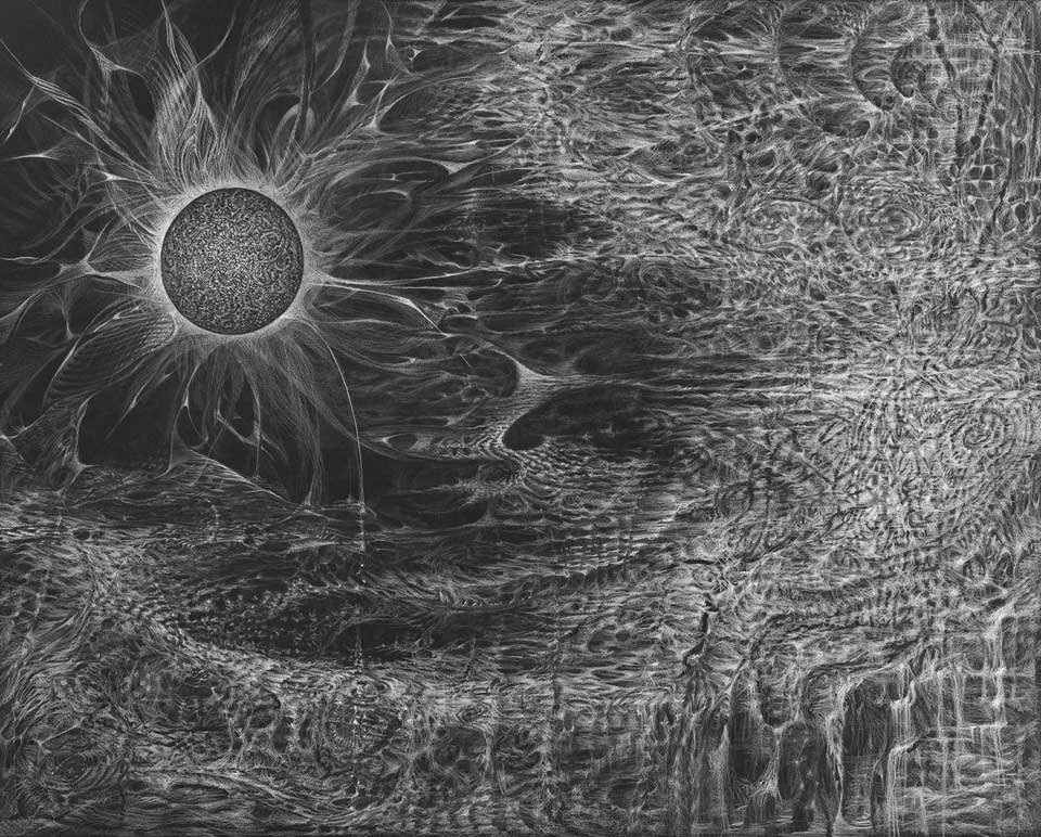 |
| Bette Burgoyne - Transillumination • 2010 • 25" x 30" • black paper, white pencil |
To get more saturated whites, I recommend putting the white pencil
down before any other colours.
Also, simply by limiting the overall colour palette the
white will stand out, like in this beautiful piece by Mia Araujo.
 |
| "The River Styx" each panel is 8.5" x 13" Graphite and white pencil on toned paper. |
2. Chalk Pastels
Pastels can be a great medium because they are so soft and
easy to blend. They are more saturated in hue and therefore can be used to draw
brighter whites than the pencils. Also, they tend to be easier to apply on top
of pencil drawings (than pencils).
However, since they are so soft, achieving fine lines
requires more practice and it may be easier to start familiarizing yourself with
chalk pastels by using them to create dreamy, misty scenes.
 |
| "flowers_2" by Graszka Paulska
pastel 100 x 70 cm
|
Because they’re so soft, chalk pastels are very malleable.
If you’re not happy with something, you can erase it, or lift it off the paper
with ease.
However, this also can be the chalk pastels’ biggest
downfall. Since the pigment adheres so loosely to the paper, it smudges easily
too. You might have worked for a long time on getting your drawing just right,
and then in one fateful moment you accidentally whip around and your arm or
sleeve smears all that effort. Imagine what a shame it would be to mess up a piece like this:
 |
| "The Snow Queen" by Christian Birmingham |
Though using spray fixatives can help keep the
chalk in place, it’s also a bit risky. Not all sprays are archival and they can
dull and darken the colours of the piece.
It’s best to get a good photo or scan an art work that uses
chalk pastels as soon as possible, because the originals may not stand the test
of time, unless they’re always safely framed behind glass or tucked away in a
plastic sleeve :(
 |
| Anna Petrova/ Анна Петрова |
I personally like to make a “pastel stash/cloud” on a
different piece of paper and then use q-tips to dip and deposit soft highlights
onto skin. (This method is great for working one-handeldly.) Rubbing the q-tip
directly on the pastel stick works too, but you might need two hands for that.

As with the white pencils, I really enjoy the look of white pastels on darker paper with only a few other colours. They make lovely studies and preliminary illustrations.
 |
| Monte Ellis |

1. Conté a Paris - France 630 - Blanc/White
2. General's Charcoal White - 558
3. Prismacolor Scholar - White
4. Koh-I-Noor Hardtmuth - Mondeluz Aquarell - 3720/1
5. Koh-I-Noor Hardtmuth - Mondeluz - 3710/1
6. Staedtler Watercolor pencils - Karat - 124/0
7. Paper Papier Plus - White
8. Crayola Wax Crayon - White
9. Koh-I-Noor - Artist's Dry Chalk - 8500-1
Hope this will be helpful to some of you!
Happy drawing!


